Two exhibitions at the British Museum
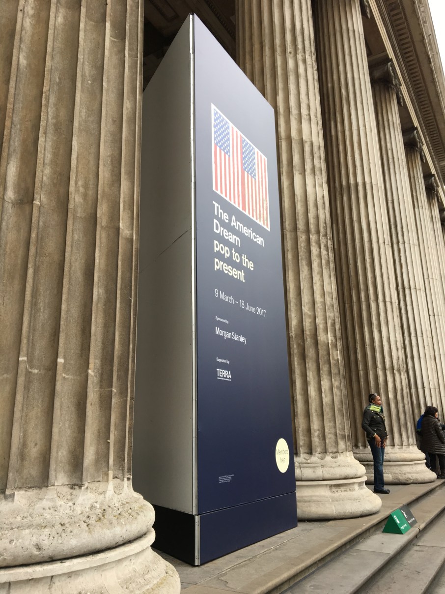
All the publicity for the British Museum recently has been for The American Dream, a show about prints from the past sixty or so years in the States. If you pair it with America Between the Wars at the RA you can get a pretty good overview of the art of twentieth century America. At the cost of quite a lot of shoe leather – neither show is negligible.
The BM’s is the more extensive however, more extensive and more comprehensive than I’d imagined it would be. Up front are the star names – Warhol, Rauschenberg (haven’t we seen enough of him lately?), Johns and Jim Dine.
The last I admit was new to me, which made him the most interesting of the nominated big three, who get their own rooms pretty much. Dine’s Red Design for Satin Heart was truly a thing of beauty. I won’t reproduce it here because as a digital image it looks a bit Clintons Cards. You have to see it in situ. Dine is more interesting than Oldenburg (who has a few prints up front) in his monumentalisation of the ordinary, for example with his print of paint brushes. He makes his re-contextualised implements living subjects whereas Oldenburg it seems is more concerned with artifice.
Then up comes Ruscha. Was I rattled by the Ruscha? (There’s one for all the Pavement fans out there.) Well, not really, it seemed that his processes – for example his use of gunpowder in print-making – were more interesting than the things he produced. Once you’ve seen three or four rooms half-full of slick stuff satirising ad-land you start to wonder whether the satire was ever there in the first place, except as a counter-cultural rhetorical device.
It was at this point (about halfway through) that I came to the opinion that the exhibition was far too big to take in in one go. But I ploughed on because in London, with so much going on, one’s best intentions of going back to a place rarely see fruition. And this is where I got a bit annoyed.
Minimalists were up next but then what’s this? The last three rooms are dedicated to Aids, women artists and black artists. And I question the whole basis of that. Because your average punter is likely to be art blind by the time they get to these rooms and therefore possibly miss some compelling work.
If the curators were going to switch to such an explicitly thematic approach I wished they’d front-loaded these rooms so that they were the first things that the public sees. Were they scared that if the punters couldn’t see a friendly Warhol from the door (well, not that friendly, it’s an electric chair) that they wouldn’t dare venture inside? Do the public have to be sold the familiar constantly?
I’m not arguing that Raschenberg/Warhol/Johns et al aren’t interesting or important, just that their work is so familiar that you only need to close your eyes to conjure it up. On the other hand I hadn’t seen ANY work by the artists in the last two rooms devoted to women and ethnic minorities (oh, except for another Warhol, who is represented by a depiction of a race riot, which seemed banal in the extreme next to much more complex work by less famous artists on the same subject of racial tension and radicalism in late twentieth century America). The unfamiliar isn’t necessarily obscure because it’s less interesting. As the Guerilla Girls point out.
So I would recommend going to the exhibition and starting at the last room. Your mind will be freshest to soak up the wonderful work of unfamiliar artists. If you’re as ignorant of American art as I am. Do not miss Kiki Smith’s Born 2002, which has the best wolf ever. Or Dotty Attie’s Mother’s Kisses which the label po-facedly informs us ‘hints at incest.’ Hints at like the Sistine Chapel hints at Christianity.
And the other show? Well, you’d hardly know it was there given the lack of press attention or indeed publicity for it in the museum itself. Just a discreet sign pretty much by the door of the prints gallery if I’m not mistaken.
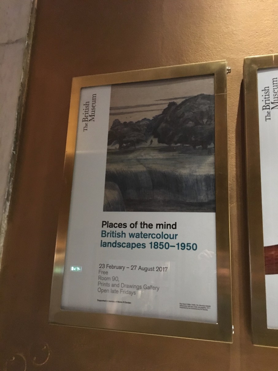
It is a wonderful thing. You might at first glance think it’s just for the connoisseur when you see Victorian depictions of the English countryside by the yard as you enter the room. But anyone could find something to their taste in here as the art gets far more radical as you progress around the room. Which is not to say that there aren’t things of genuine beauty – of course Turner, Constable and Cotman blow everything else away.
But I was taken by the unexpected depictions of London in watercolour. Especially this week. A Nevinson of Air Street and Piccadilly Circus tube under construction has a bus fleetingly viewed through a half-built Regent St Quadrant. Joseph Parnell’s Balloons Over London showed barrage balloons over the Thames at Battersea during WW1. But not barrage balloons as I imagine them – big fat silver sausages. These balloons are dainty Montgolfier affairs. Montgolfier turned sinister.
And best of all Henry Moore, London Skyline. St Paul’s is central to an extraordinary composition of a sheltering family, seemingly sheltering in the womb of London while wraiths stalk a fractured landscape. But St. Paul’s, like The Dude, abides. London is the place for me in good times and bad. Oh, and the watercolours are free.
#BritishMuseum #AmericanDream #London #Art
Art Exhibitions London Museums Art british museum Exhibitions London Review The American Dream Watercolours
f1insburyparker View All →
Blue Badge guide to London and academic specialising in early twentieth century history. Blogging on history, academia, and food and culture in the capital (and occasionally elsewhere).
